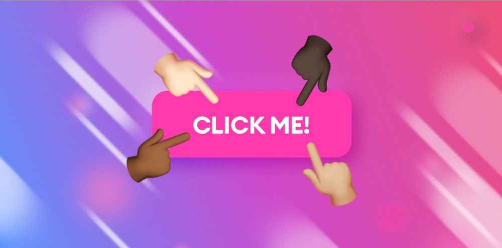

What is a button?
A button is an interactive element with a clearly labeled action. You can bet that if it says “Pay” on a button, clicking it will likely ask you for your credit card details.

Buttons are essential to UI, because most interfaces require some sort of an action from us to proceed. Whether it’s saving, checking-out or downloading something, buttons are everywhere.
Let’s talk about how to make them work better with just five simple steps. There’s obviously more that can be done with buttons, but these five steps are essential.
Let’s start with the anatomy of a button
Buttons have a couple of defining characteristics.
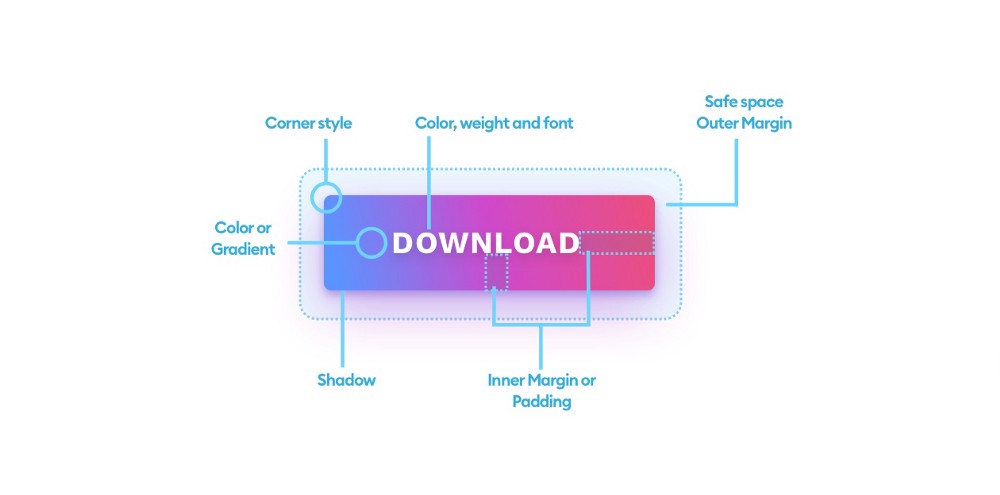
As a typical shape they can have a fill and a border and a shadow. As far as spacing goes they have an inner margin (also known as padding) and an outer margin which serves as a safe-space for our button.
The shape itself can have sharp or fully rounded corners with the use of a border-radius (or corner-radius in some tools) value.
The label on the button is usually text, sometimes with an icon. Adding a right-facing chevron to your buttons is known to bump up conversions a little bit. The label text is defined by the font, its color and font-style.
Now that you know the basics
Here are my five golden rules for better button design:
A button and a shape that doesn’t look like a button.
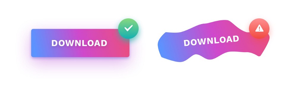
1. A button should look like a button
This one is pretty simple. We are used to real-world buttons being rectangles (and sometimes circles). Having a shape that’s neither a rectangle nor a circle is a sure way to confuse your users.
This is how Skeuomorphism is actually still present in digital interfaces even when they go almost completely flat. Buttons in the UI still need to look and feel like they’re a button on your TV-remote.
Having an “organic”, blobby shape as a button won’t work. Triangles and Hexagons also will take a lot longer to process them as buttons. Some users may never discover what they do.
If you don’t want to have a rectangle or a circle as your main button shape, the only other option is an underlined text-link. If you’re unsure of the color — dark blue works the best.
2. Size
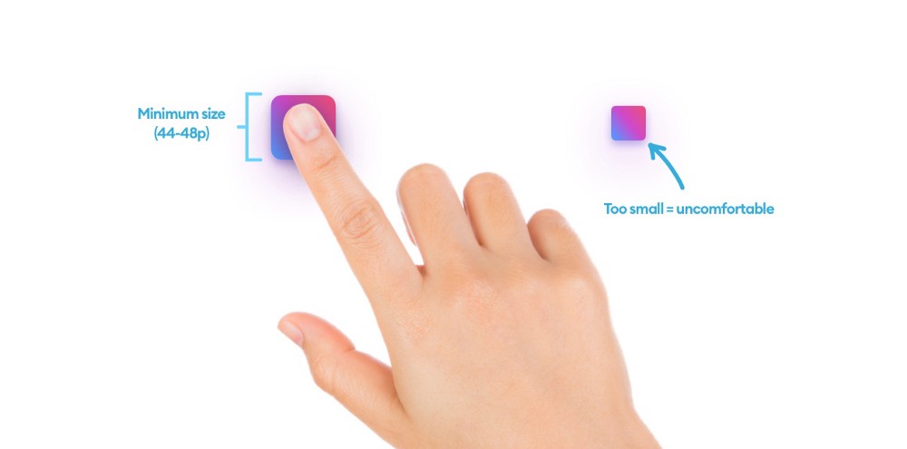
Have you ever had to reset an electronic device by first needing to find a needle to actually push in a super-small reset button? This design concept is done on purpose, so you won’t reset your device by accident.
Now imagine if all of the buttons were that small. That would make them incredibly hard to use and very annoying.
Buttons should be big enough to comfortably use them. But how big is that?
With the touch-screen era we usually measure it by a typical fingertip size in relation to screen density. At 1x a square the size of 44 to 48 points is starting to be comfortable to touch. Some apps, like Tinder experimented with enlarging their CTA buttons beyong 50 points (height) and noted pretty good results too. Obviously you can’t go too far, but 50–60 points in height is worth testing.
When designing for desktop we can go a little bit smaller, as the mouse cursor is more precise, but don’t go too small. It still has to be easy to point the cursor at, so a good 32 point size should often be the minimum.

3. Alignment is everything!
The biggest visual problem of all UI’s out there is bad button-label alignment. While most designers and developers manage to center it horizontally, it’s rarely every centered vertically. In most cases the label is either just a tiny bit too high or too low.
Uppercase labels are obviously easier to center, but even when working with Title-Case it’s best to stick to aligning it using the baseline (or just align it to the first, capital letter and ignore the descending y’s, j’s and g’s)
The button size and the font size are also important. If you have a button that’s 32 points and text that is 17 points, there is no way to have it perfectly in the center. Adjust either one of them to match.
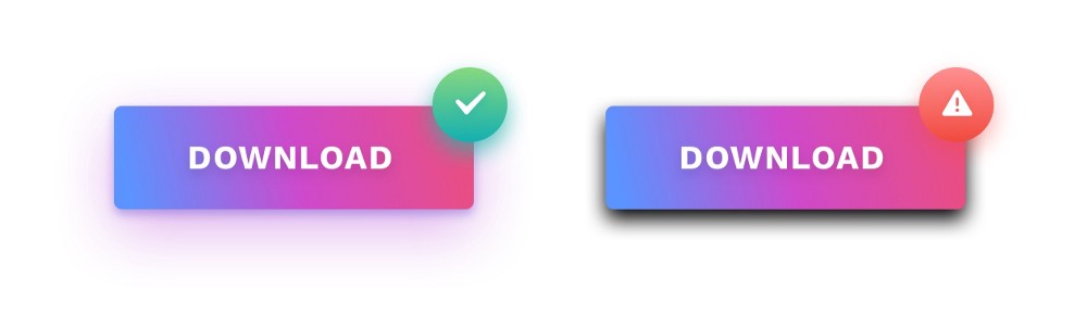
4. Work on your shadows
Drop-shadows help an object stand out against the background and help with identifying it as something you can click or tap.
That’s because if something looks like it’s higher than the background, we naturally understand, that it can be pushed down.
To make your buttons look more friendly, add a hint of the background color to the shadow color. In the example above the shadow is a mix of blue. Hard, dark and contrasty shadows should be avoided. While they do bring the attention to the button, they look jarring and unpleasant and take the attention away from everything else.
5. Readable labels
We already established, that the button labels need to be centered, but they also need enough breathing room to be readable. Avoid buttons with barely any space around the text. A good rule is to use the Capital letter W from your label font above and below the label. And 2 x W on the sides.
Of course the button can be wider than that, as this only shows the minimum size that both looks good and helps with readability.
Go push some buttons!
Knowing all these rules will help you with other UI elements as well, but as buttons are the most important UI part, it’s best to get them up to speed first.