Sometimes, advice on how not to do turns out to be the most practical,
because simple guides and recommendations always leave room for wrong decisions. That’s why we decided to share some examples of bad user experience with you.
20 Great Examples of How You Can Ruin User Experience
So, let’s not keep you waiting: here they are — the most stupid mistakes in creating UX, which even experienced webmasters often make.
#1 — Autoplay of audio/video
Needless to say, one of the most annoying things that can overtake website users is the instantaneous audio playback when opening a web page. In short, instead of forcing your website visitors to turn down the volume in a hurry, just provide a default mute with an option to turn it off.

Make media content manageable. Designed by Earthr.
#2 — Misuse of breaking news
Is COVID-19 making you feel bad? Our furniture will fix that. Our sushi delivery will fix that. Our phones will fix it. Similar, perhaps less literal, phrases can be found on almost every website whose administrators decided to add a little relevance to its textual content. Please don’t do that. You shouldn’t drag any world problems to your business niche if it’s not connected with them.

A good example of using news content on a website. Designed by Earthr.
#3 — Unstructured web forms
The forms below are quite simple. They may not confuse anyone (although such cases also happen), but the “aftertaste” after visiting websites with such forms won’t be pleasant. Spend a few extra minutes to personalize your forms.

Personalization is key. Designed by Alex Banaga
#4 — Long dropdowns
Have you ever tried to get to the needed item in a dropdown menu when it has to be scrolled? Believe us, this is not an easy task, especially for mobile users. Do not complicate their lives, this is not an easy thing, alas.

Long dropdowns can be the shortest way to ruin UX
#5 — Violation of the three-click rule
Have you checked how many clicks a user needs to make on your website to complete the desired action? If for basic tasks this number exceeds three, something in your UX is definitely not right.

#6 — Сhecklists with a large number of options
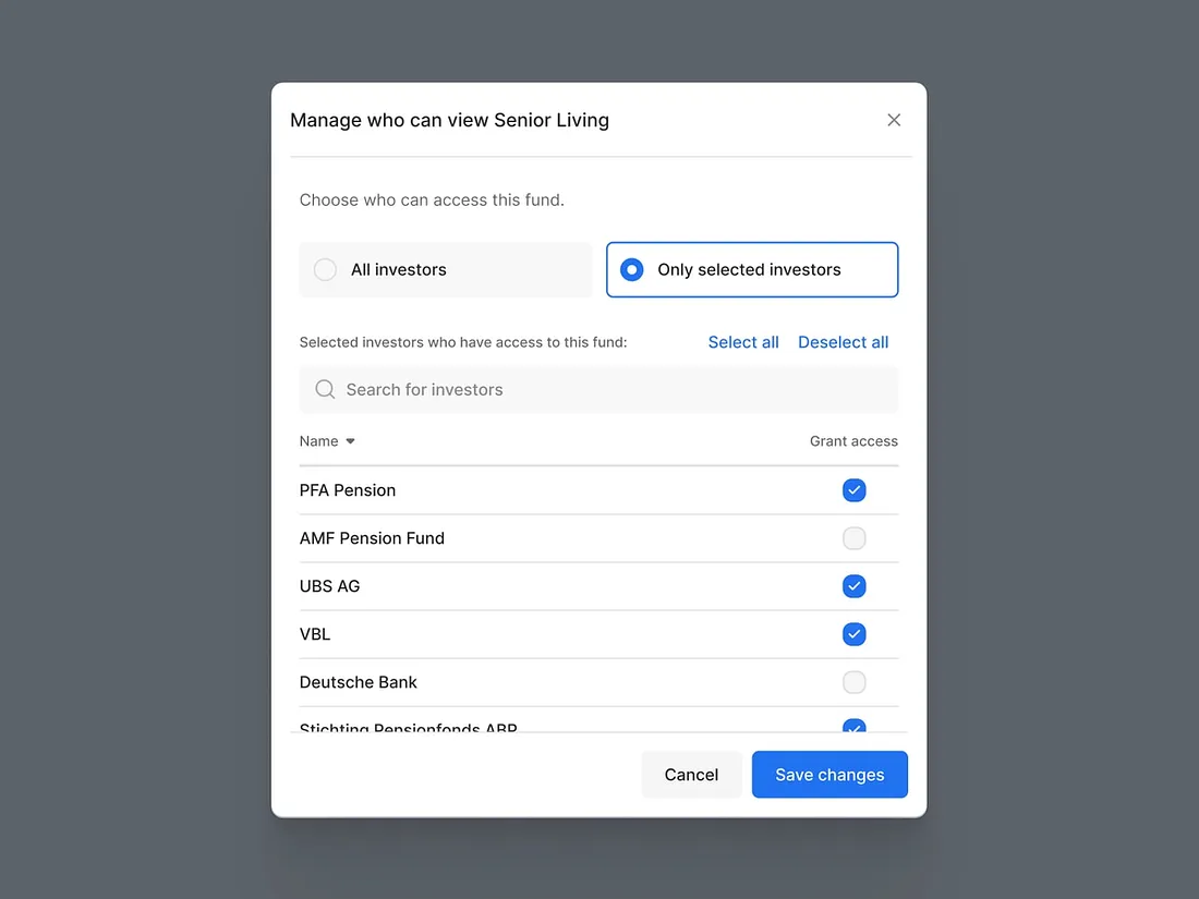
Did you know that checklists were originally created so that the user could give a binary yes or no answer? This is not entirely true, there may be more options, but you definitely shouldn’t abuse them.

Don’t use too long checklists
#7 — Plenty of tooltips
Have you ever had tooltips clutter up important parts of the interface? We are sure that each of us has faced a similar situation. Indeed, if your interface requires such detailed explanations, perhaps it’s a bad interface and needs to be made more intuitive?

#8 — Low discoverability
Are you sure that your users won’t have to look for a needle in a haystack? We are talking about features that should be visible to the naked eye. Decide on the priority functionality and only then complete the less important interface elements.

Analyze the user's needs. Designed by Craftwork
#9 — Annoying color scheme
If color were so unimportant, there would be no Pantone Color Institute. In fact, people pay a lot of attention to color, and this rule applies to website color scheme as well. Therefore, instead of choosing something brighter, take an interest in what shades have the most beneficial effect on human perception.

#10 — Complex password requirements
Do you share secret Pentagon data on your website? Or maybe post conspiracy theories? If this is not so, why allow only people with outstanding memory to access its resources? Apparently, only they will be able to access their accounts on your website due to the high password requirements.

Keep a balance between safety and usability
#11 — CAPTCHA overuse
We never understood why a CAPTCHA was required to enter an account on the marketplace because usually, robots have nothing to do there. If you want users to love your UX, don’t put sand in the wheels when they try to load web pages.

The user isn’t born to search for all traffic lights in photos
#12 — Incorrect use of demo content
If your website is required to promote extra content on a paid basis, there is no need to embed offers to download demo content on every web page. This will quickly bother your visitors by having to constantly click ‘X’ to close the popup.

Don’t force, just love
#13 — Lack of intuitiveness
Very often, the creative thinking of webmasters takes precedence over sanity. As a result, they create solutions, as in the example below. What to click, where to click? Let me move on to another website.

We’re not saying that it is necessary to kill creativity. We only kindly remind you that users love patterns
#14 — Specific jargon
You don’t have to use buzzwords to be trendy. After all, how do you know who will be the next visitor to your website? Perhaps it will be a person far from your main target audience. Please don’t forget about it. Speak clearly.

#15 — Empty space
Too little content? Come on, if even when the Internet is turned off, Google finds something to captivate users with (we all played with pixel Tirex), you should also have enough imagination to fill in empty spaces on such a web page.

A good example of how to use empty spaces
#16 — Authorization issues
Authorization on the website is a reason to increase conversion rates. Why then complicate this procedure? Offer to test your login form with at least a couple of people to make sure it’s not complicated.

#17 — Overuse in words
Finding a good copywriter is not an easy task. However, it’s much more difficult to analyze later why users don’t visit your website as often as you would like. Look for those who can write concisely and to the point, and you won’t go wrong.

Entrust the work on the text to professionals. Designed by QArea
#18 — Unneeded messages
There is nothing worse than texting your boss that you want to quit, change your mind, hastily delete the message, and then try to explain what you wanted to write in it. We are talking about the example below. Many web solutions fall short of this approach. Unlike yours, if you follow our recommendations.

#19 — Lack o recommendations what to do
Consider that users are children who need clear instructions on what to do next and how to do it.

Try to explain how to use your site
#20 — Load delay
Don’t keep your users waiting. A few years ago, an acceptable download speed was equal to three seconds. Today this number is much less.

Final Words
We hope that we have saved you from mistakes that make it difficult for your website visitors to interact with its interface. Therefore, now you are one step closer to creating the perfect user experience.

