

A group chat that tells the stories of design changes across the top apps.
The design changes in major apps such as Spotify, Instagram, Facebook, and more were told through a group chat. My friends and I unintentionally began sharing major changes we noticed on apps we used daily in 2018. As we set out on a journey to become Product Designers that summer, it connected us to our design brain and to each other.
The following design changes were tested by their respective companies for short periods of time and some have become permanent features today in 2020.
Welcome to 2018. A time where design went off the rails!
September 1st, 2018: Facebook Comment Upvoting
Giving the user the ability to give their input on the most “thoughtful” comments.
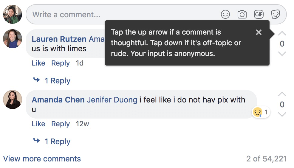
Benefits:
- Gives the user an additional way to interact with a comment
- Empowers someone to engage with content that would not normally comment
Negatives:
- Why does the tooltip tell you to downvote something that is rude? It encourages a rude comment or the ability for it to live on a platform
- In a popular comment section of a video or influencer, it will be hard to discover more genuine comments rather than those that show popular opinions
September 7, 2018: Instagram Contextual Replies
Suggested replies to Instagram posts based on your most used emojis.
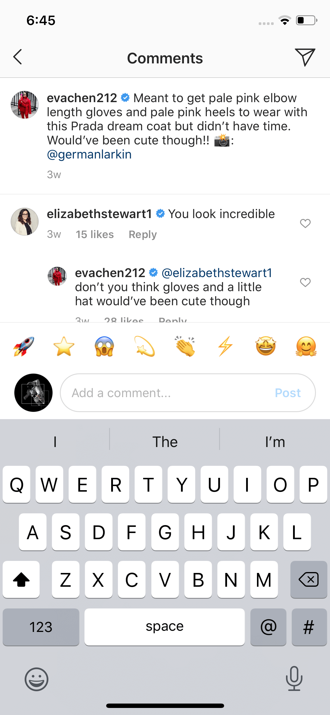
Benefits:
- Saves the user time
- Shows the power of personalization
Negatives:
- Questions if the interaction is meaningful as it encourages emojis as opposed to verbal feedback
- Can be creepy to the user if the design seems much smarter
October 7th, 2018: Snapchat copies Instagram Stories Layout
Snapchat users can view their current stories in a card format.
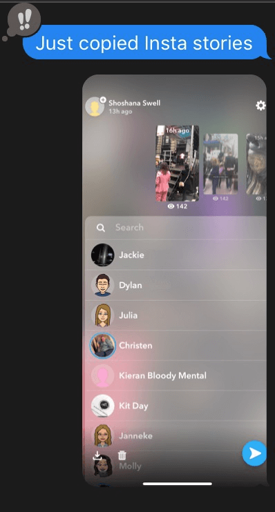
Benefits:
- Ability to quickly preview stories without clicking through individual stories
- Consistency to other ephemeral platforms
Negatives:
- The majority of the space is not used for any type of conversation or analytics for the user. If users have many followers is this use of space beneficial?
October 7th, 2018: Spotify Music Sharing in iMessage
Share a song via iMessage in a conversation.
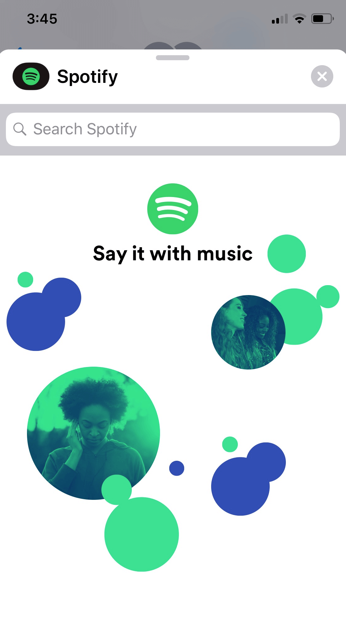
Benefits:
- Quick and easy for a user to share a song in the moment of a text conversation
Negatives:
- Does not get the user back on Spotify’s app
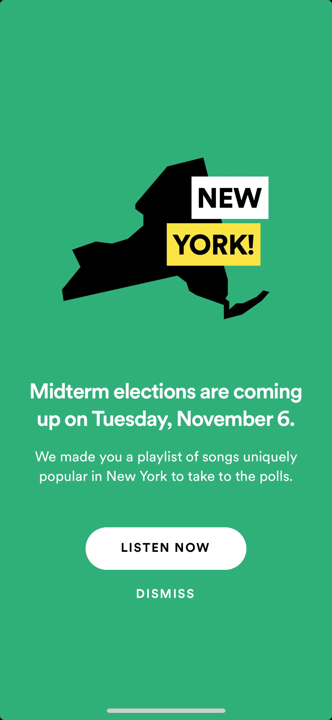
October 30th: Spotify Takes Political Action
Pop-up message to bring users to a playlist to listen to as they go vote.
Benefits:
- Spotify is focusing on design that provides social value
Negatives:
- It does not give actionable information about voting. It targets a user that is informed and only provides a playlist.
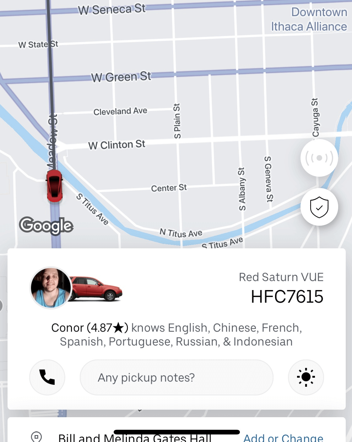
November 8th: Uber Adds Languages
Uber provides information about the driver’s languages.
Benefits:
- Makes the rider feel more comfortable to know the driver speaks a similar language
Negatives:
- The design occupies a lot of space to list the languages. How valuable is it to the user?
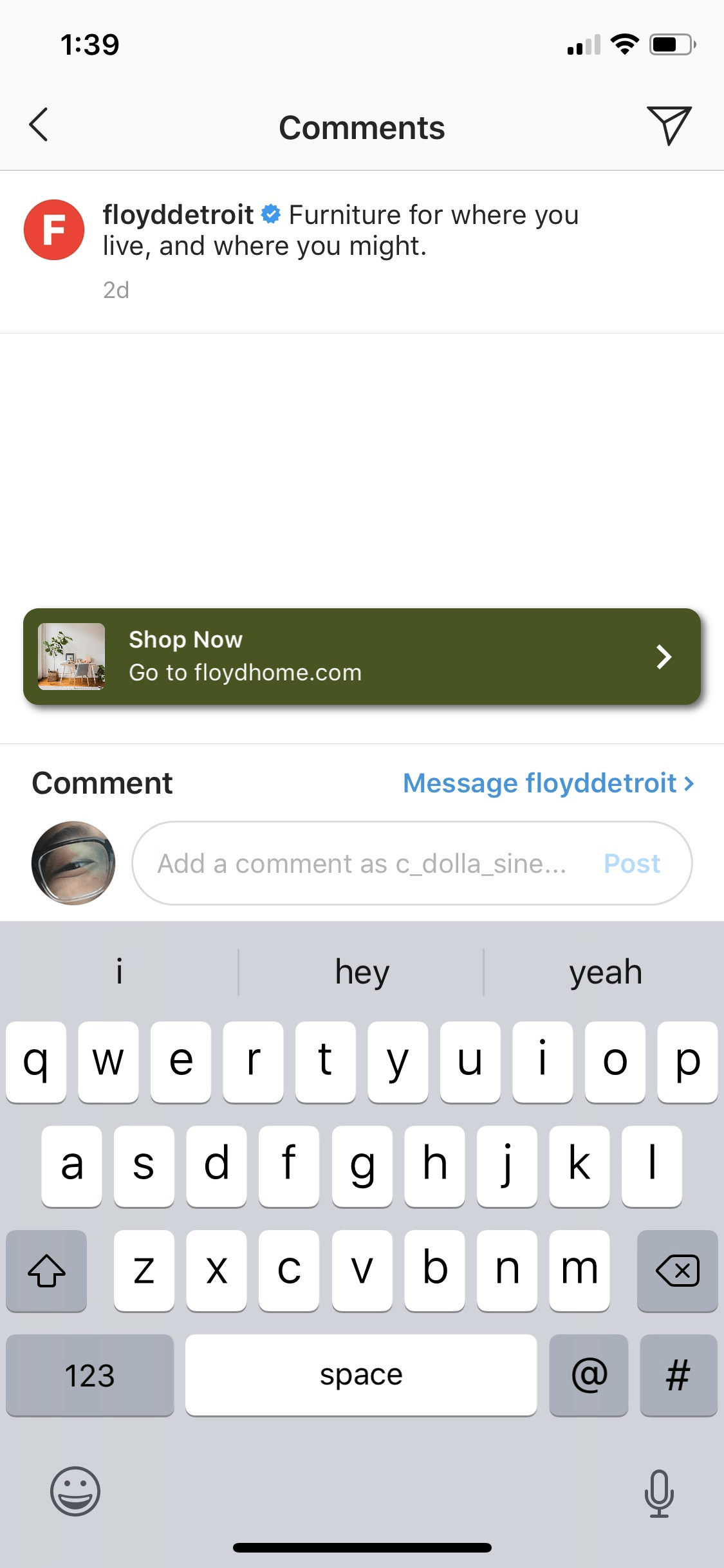
November 11th, 2018: Instagram uses Pop-Ups
Pop-up to take the user to a website.
Benefits:
- Brings users to shop related content to the brand’s page
- Notifies the user that the page has a website which helps them save time by eliminating time to discover it on page’s profile
Negatives:
- The link takes the user off the IG app
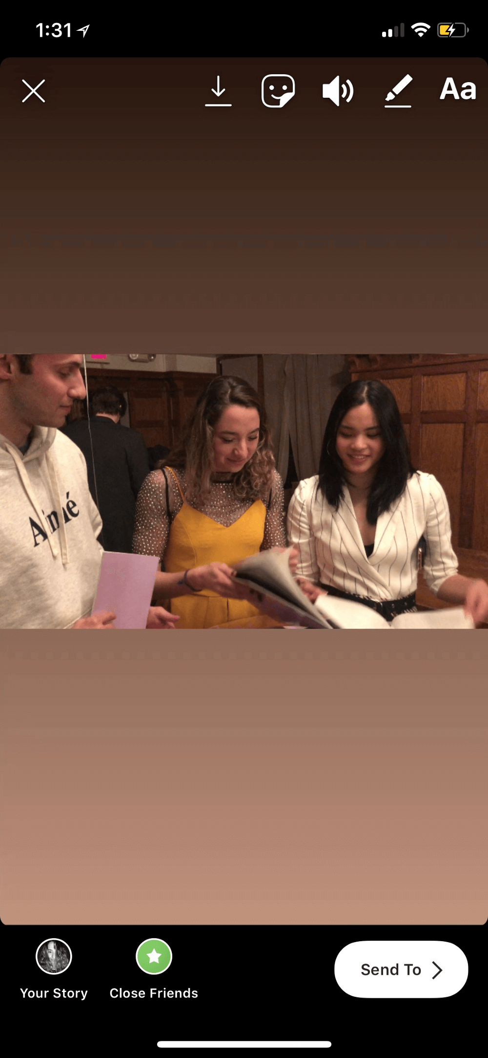
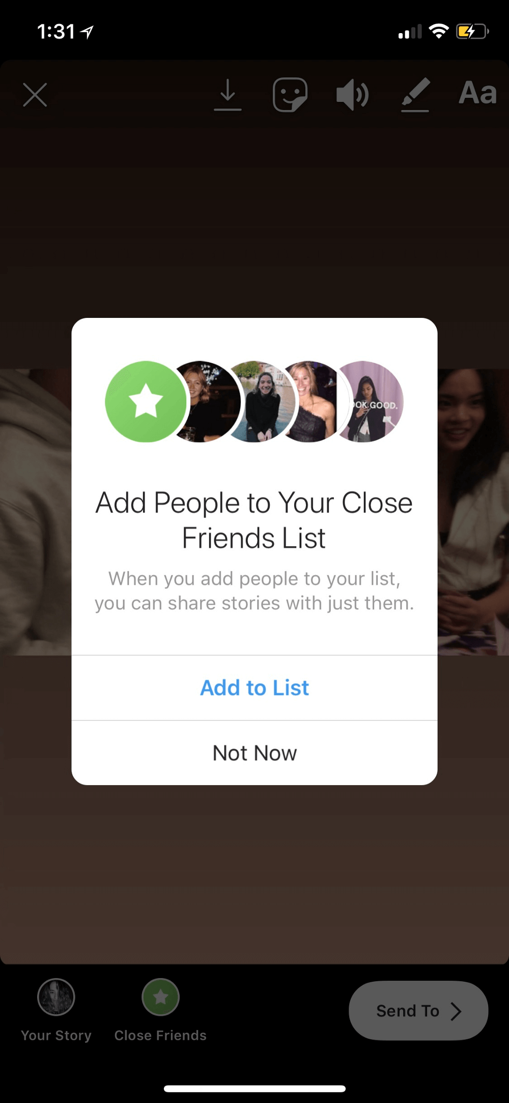
December 1st, 2018: IG Close Friends
Add specific users to your “close friends” list to share stories to your inner circle.
 |
|
Benefits:
- Strengthens relationships with your inner circle
- Provides a more light-weight way to share your daily moments
Negatives:
- Decreases post to your larger following
- Can be harmful to know you are not on someone’s close friend list
December 19th, 2018: IG Exploring with Hashtags
One of the explore page options a category to explore further through a hashtag.
 |
 |
Benefits:
- Focused explorations on categories to create a better way for users to discover new content and accounts
Negatives:
- Unclear if the user has the option to change or explore through the hashtag
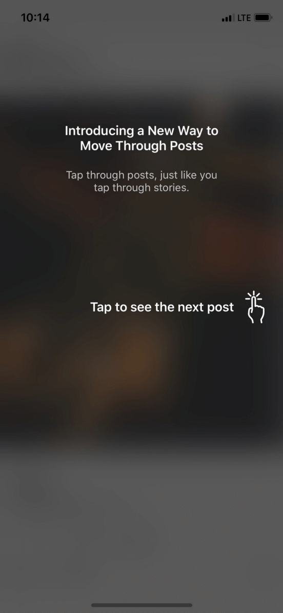
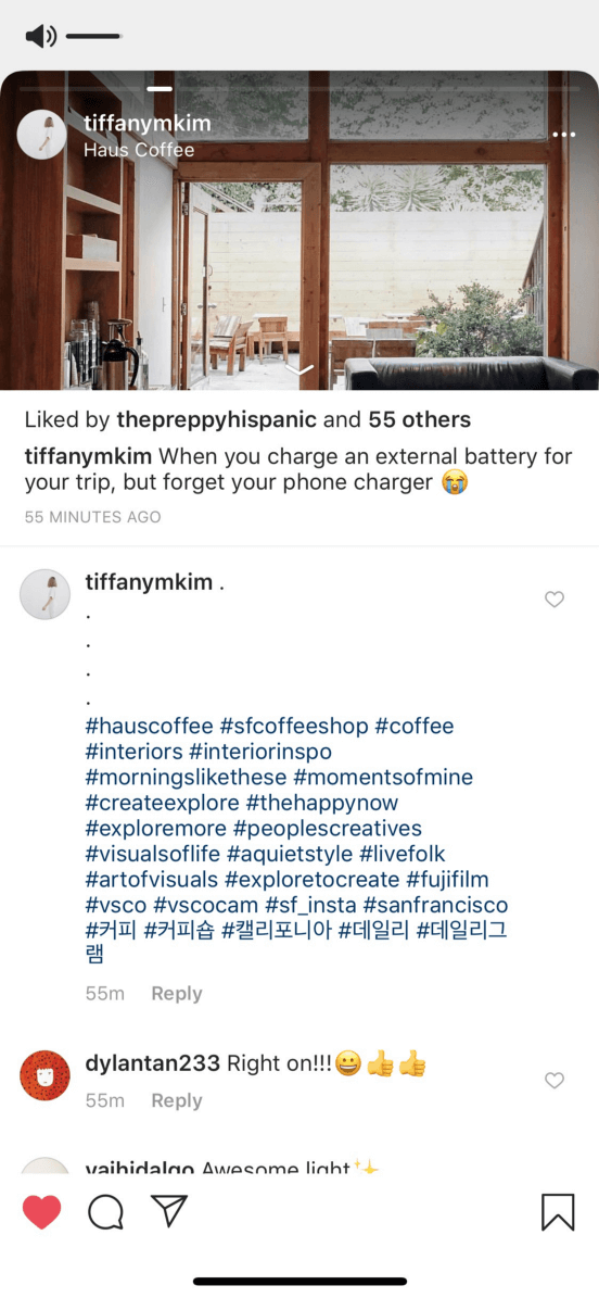
December 27th, 2018: Instagram’s Horizontal Scroll
The messages below sum it up.
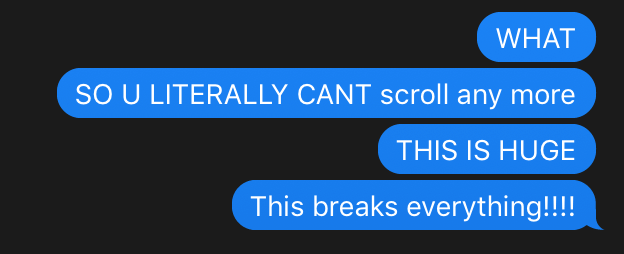
Instagram changed from a vertical scroll to a fixed horizontal scroll.
 |
 |
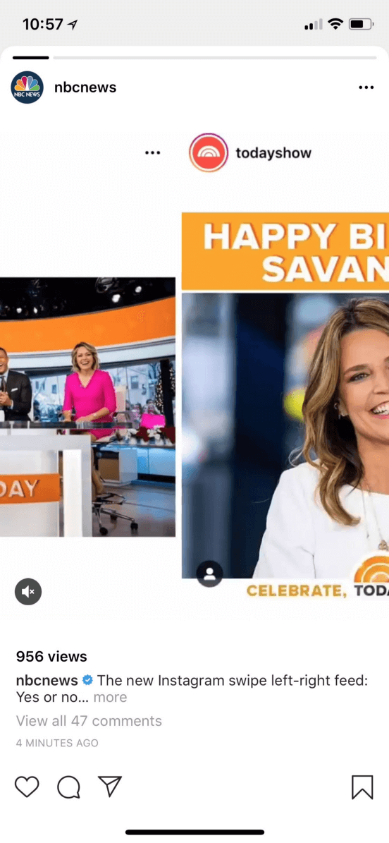 |
Benefits:
- Priorities well-being to break the addictive vertical scroll
- Created a lot of buzz on all platforms where people were discussing the design decision
Negatives:
- Breaks interaction patterns dramatically that confuses the user
- A decrease in time spent on user — bad for IG’s business
- The progress bar does not show accurate representations