
The 12 principles of animation
In 1981 two Disney animators, Ollie Johnston and Frank Thomas proposed that all animation consists of twelve basic principles. These principles adhere to the laws of physics mentioned earlier and serve as guidelines to create realistic movement.
These principles are not just applicable to Frozen but have excellent value when applied to user experiences and design as long as we keep the physics in mind.
I've listed these principles along with of Dribbble’s best examples below (in no particular order).
1. Squash and stretch
In nature objects are malleable — their shapes change as they interact with their world. They are able to squash and stretch depending on their composition. Similarly, our interfaces can squash and stretch when they are interacted with. The weight and center of gravity of the component do not change but is merely displaced.
Squash and stretch is also a useful way to do animations for scale that are less awkward.

2. Anticipation
Anticipation refers to the small actions that lead up to a much larger action. In the wild, a cat might lower its back and pull back its ears in anticipation of pouncing its prey. Anticipation could also be the complete lack of an action such as the dramatic pause before the cat pounces. This anticipation could serve as a warning, be used to entice or create excitement.
In a very similar way, we can use small animations to create anticipation with our users. Hover effects are a great example of this as it indicates to the user that this object (for example a button) can perform a larger action.
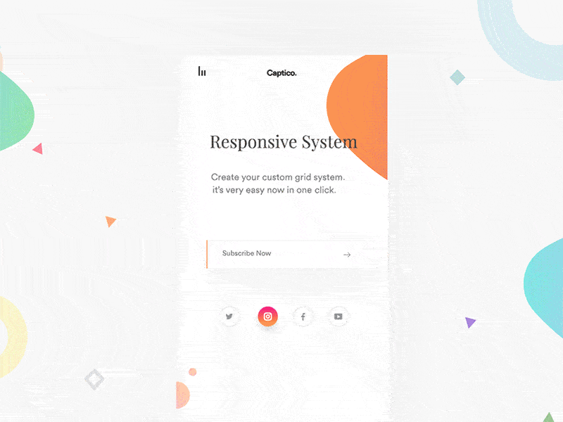
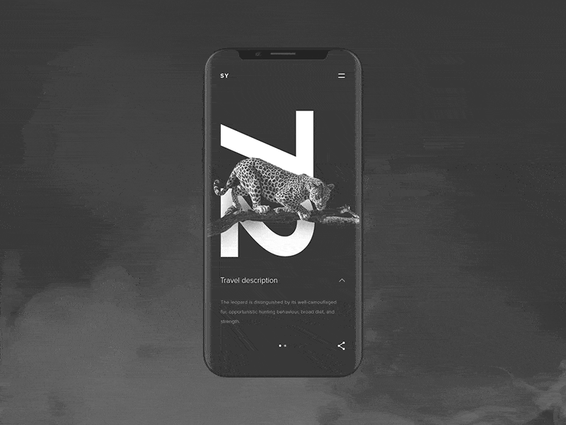
3. Staging
Staging (or the old adage of setting the stage) involves setting up a scene in order to emphasize characters, objects or events. This could be done in several ways such as lighting, music or camera movement. Staging could also be used to build anticipation.
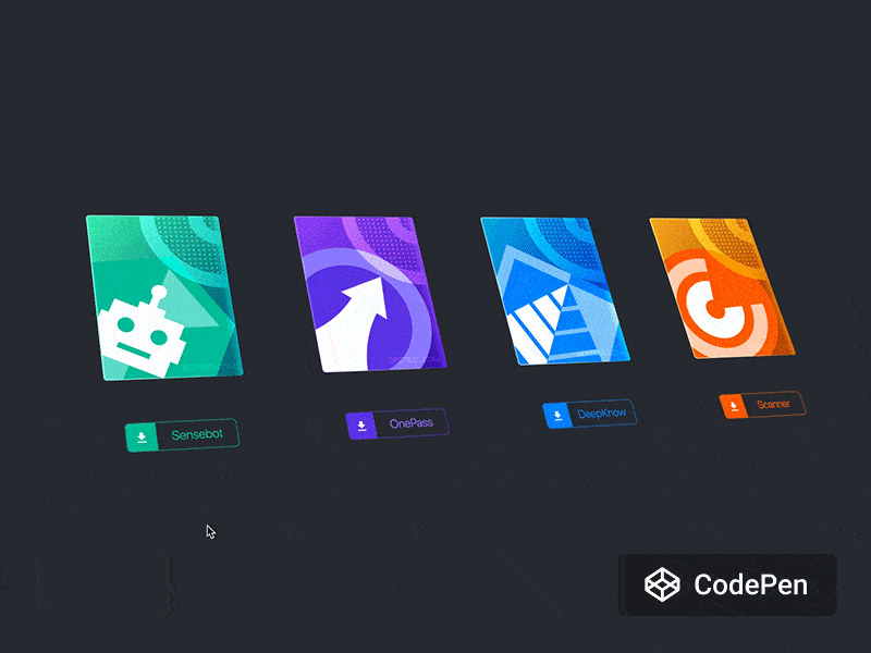
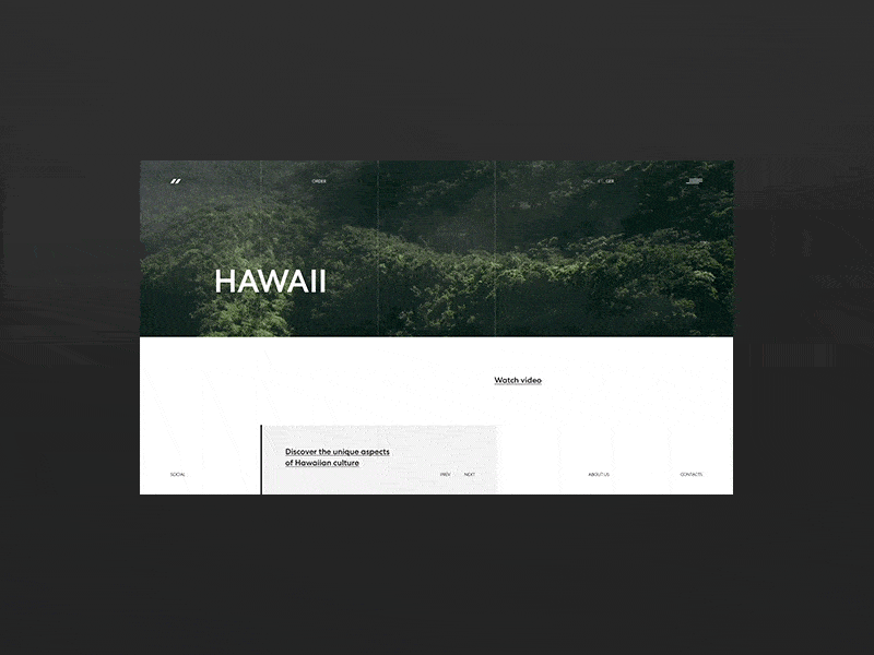
A classic example of the staging principle in interface design is a loading icon. Not only does this solve a technical problem, but it also lets the user know that the “stage” is literally being set. Furthermore, the actual design of the loader could be used for staging as well; giving the user a glimpse into the type of content they could expect.

Skeleton loading, an extension of the loader icon, is considered a much better loading experience. A “skeleton” of the content to be loaded is shown to the user and then gets filled in as the content loads.

4. Straight ahead action and pose to pose
This principle refers to the way animation is drawn. With straight ahead, you start at frame 1 and draw each subsequent frame. This often results in much better realism and smoothness as you are in control of each subsequent action.
With pose to pose, you might draw the first frame, then the end frame, and only then would you fill in the frames in between.
Most animation in UI today would be pose to pose. As developers, we generally write a static component with CSS, then write the CSS for the animated state and we then toggle this animation with a class or key frames.
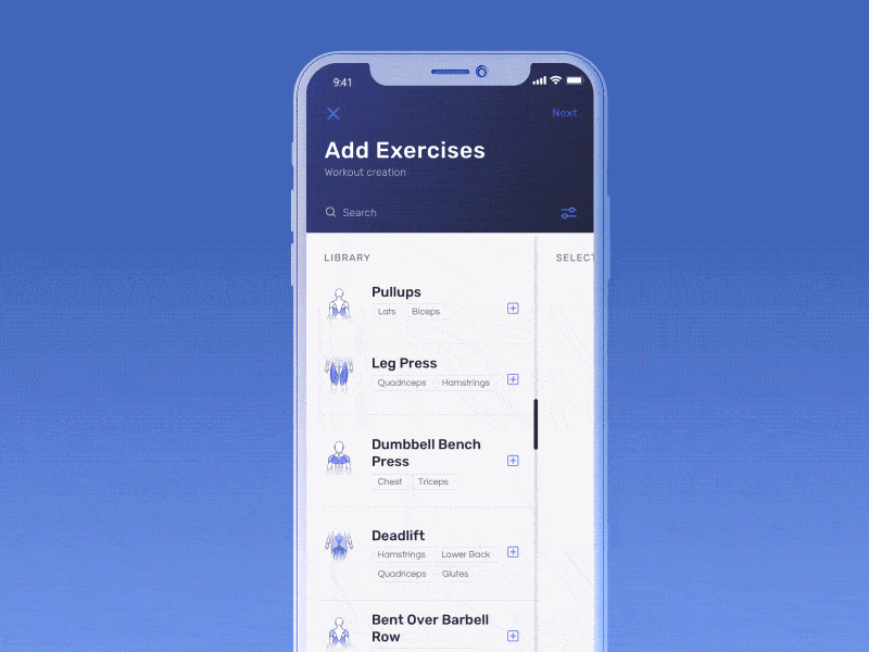
5. Follow through and overlapping action
Objects in the real world often consist of multiple moving parts. Cars, people, animals, plants — all good examples. These multiple parts are all affected differently by forces like gravity due to their weight and size. As a result, the same object can have parts that move at different speeds or rotate at different angles. They might also have different levels of resistance due to their size which impacts how long they take to accelerate or decelerate.
In a similar fashion, UI components consist of multiple parts, whether it’s typography, color, shape or spacing. If you are animating multiple parts of the same component it’s important to consider the weight and size each has as well as their relationship to one another. Components that are part of the same group should always animate together, but it’s the subtle differences in speed and acceleration that will make it a good experience.
Perhaps the most notorious example of overlapping action is age-old parallax animation.
6. Slow in and out (Easing)
Slow in and out is really just Disney’s term for easing. Objects in life rarely come to an instant halt — they tend to gradually lose momentum and slow down.
Most designers and developers implement easing in their animation already. But do we sometimes go overboard? It’s very easy to mess up an easing curve and this will leave users feeling a bit uneasy. There are great resources for grabbing pre-built easing curves — my favorite being Animista.
7. Arcs
In nature things are very rarely animated in a straight line, simply because no one can throw a ball in an exact straight line. Objects in nature often move in what are called arcs. Arcs are essentially the curved path on which a ball would move if you were to throw it.
Generally, interfaces are aligned to some sort of grid system so we tend not to animate components in arcs. In a way easing is the arc that we use as it makes our animations feel as if they are animating on an arc. That said, there is real value in implementing some sort of arc in these animations as they add a sense of natural fluidity. It’s just a case of finding the right opportunities.
8. Secondary action
Secondary actions is any action that happens in addition to the main action. These actions are generally used to support the main action. A real world example would be the turning of a wheel as a bicycle moves.
Secondary actions are excellent for giving the user additional information about their actions. Icons in buttons are a pretty common example of this.

9. Timing
We've already looked at timing in terms of physics but there is another, much more literal application. Timing could also refer to how multiple animations play out in sequence. Google refers to this quite aptly as an interface’s choreography.
Transition choreography is a coordinated sequence of motion that maintains user focus as the interface adapts.
- Google Material Design
The order in which components animate is a great way to lead a user through a journey. Our eyes react to movement, even on a micro scale.
10. Exaggeration
Exaggeration (along with solid drawing and appeal) is where animators get to be a bit more creative. The size, shape or movement of an object is exaggerated beyond realism to add emphasis or interest to an object.

11 & 12. Solid drawing & appeal
Both of these, quite simply, refers to how appealing your component or experience is to your user. This comes down to good design, good UI, great experiences and refined animation.
- << Prev
- Next